I have developed an understanding of how to use the blend tool in Adobe Illustrator using the tutorial from the A2 Graphics Blog, I found that this tutorial to be very simple once I got use to it. The word worked well with the Blends created and how they physically looked however, I prefer the way in which the technique can be utilised to create a 3D effect with the spirals. the stand out for me and this is something I would like to incorporate into the background imagery of the type.
Tuesday, 5 March 2013
Monday, 4 March 2013
David Carsen
I found David Carsen work to be very exciting in many ways. I am really pleased as to see how free the typographic outcome makes ones work. The bright colours and free flowing type, personalizes the poster a little more which helps the viewer to understand and appreciate the poster bait more e.g. In the poster the images was made to help Barrack Obama's political campaign in 2008. the bold text saying Hope, Change are all of what he was trying to achieve when he gets into office. The blending of the colours may symbolise HIstory in the making where he became the first Black president of the USA. Hope being the largest of the texts also has a double meaning being that it breaks down Barriers and stereotypes where that no matter your race, gender, background you can make it in America as a minority child growing in that society. The dark coloured texts are well represented throughout the image as this represents the minorities in the country. The fading texts symbolizes the older boundaries that are breaking away with each generation. The image has a diverse colour range which in turn spreads the message of equality, the image relates to american history due to previous issues with racism, segregation and mass in-equality. The second of the 2 images has more photographic and illustrative elements in it to that of the first, with a wide range of colour in all parts of the image. The use of Drawn and hand made elements in the image adds to the degree of difficulty the artist has to go through to create the image, I found that the hand made elements are moulded into the image in a very subtle way making them seem as if they were apart of the original image. The artist thinks very carefully about the theme in which he works on and I believe that a lot of the thought process is fully focused and based around that theme, in this second image he is trying to illustrate a surfing Contest in Rio De Janeiro however after translation the typography become much more clear to who it appeals to "Pablo Ugartetxea surfb animus favela surf club eavela of cantagalo peacock and pavavaozinho 28 shantytown camps along N.12, 1 and Ipanema, Rio de janeiro". The image suggests a Oxymoron as a viewer who does not understand Portuguese you view the image differently and the typography, as it doesn't affect you
however with understanding of the words in translation such as 'animus' which means to have a ill will arousing active hostility. having this information changes your perspective and thoughts on the image. The artist has achieved what he has set out to, in being that the letters on a page is art. In the image at first glance I had different thoughts on the image until it was made clear what the words actually say and mean. the background seems to be blend in with the text but due to the translation and your thoughts you see it as materials found the Favelas and Shantytowns, it seems that the background is pealing away which in term is symbolism for the active hostility that is rising.
I believe that David Carsen's work is very strong and interesting, there is a lot going on in the images with such bright and inviting colours that really catches the viewers eye, however it is the level of complexity with the images and there meanings which really cause the work to stick. The way in which the artist molds the words into any environment and still has the ability to get his point across is what art is about I think with this new found understanding He is someone I will regard as one of my favourite graphic artist. In regards to my own work I will be taking theses elements through to create my own work without making it too complex. I will also try to work with in meaning of Inside outside and in-between to create my outcomes.
Saturday, 2 March 2013
A2 Unit 4 Mindmap
This is a CAD representation of the mindmap that is presented in my book. i really like the possibilities that the typography brief presents this is my reason of choice however I do need to keep in mind that I should work with in reason and not make the work I am doing too complex, so others can understand.
Friday, 1 March 2013
Unit 4 Exam: Typography Brief
I have decided to go with the Typography brief due to the creative control it allows me to have over the outcomes. I do believe that working with the typography brief will help me to create the best possible outcome with in the theme Inside Outside and Inbetween.
Sunday, 27 January 2013
Final Piece Front, Binder and Back and Evaluation
I found that the designs I have created in this project works really well and shows how far I have came since the previous bodies of work I have completed. I have worked really hard on my designs and have underwent a lot of tough times to create it. I believe that I stuck to the design Brief to a great extent in the designing and development of this outcome on many occasions, I have also created something that the target audience/fans can relate to and appreciate and taking a closer look at the outcomes you can identify certain words and due to the over population of them you start to finish the sentences of with your individual perspective. this just adds to the music in so many ways as the artist's style in his music is to tell stories, make us as individuals listen to the music but to also THINK; and I believe that the same can be said about my outcome. the array of colours used in the image helps to explain why the moods and emotions shown the the song as some songs tell very dark story that are mostly from experience; they colours also represent the diversity/age group in people that listen to the artist work and supports what he speaks on. I found that the artist that I have researched and analyzed in this project has helped a lot with the outcome I think I kept a closer link to what needs to be done in each process of development and what needs to be done to move on to the next level. The works of the artist also made me realize how hard they had to think and repeat experiments before embarking on a journey to create the final outcome. As a result I have gathered that information very well and it has thought how to asses my work in a more critical manner to better my improve using peer assessment also helped as it have me a second/third opinion to prevent a biased train of thought. I found that Tim Marrs, Miles Donovan and Andy Potts were the main artist that inspired my work the subtle use of mediums that are both hand made and CAD created, moulded into one image to create such aesthetically pleasing outcomes are what I looked deeper into and hoped to achieve. The design isn't over complicated and are very easy to read and understand, however it has such a powerful effect on viewers which is what will cause them to remember the look of the design and appreciate it. I am really pleased with the design and my growth over this project in the way that I was able to complete it because of this I can honestly say I am looking forward to the next project and the road that is ahead.
Final Piece
These are the images that I have produced for my final design I have adjusted the tones in the typography images so that they are not as bright as the previous design. I really found that they work well together and as a front and back page for the magazine that will represent the artist's new album as it features the artist and his lyrics with the design. It is made clear what the main story of the magazine was going to be this is something I thought about as I thought it was lacking in previous designs. The structure of the artist's face still has visibility which helps you construct an image with in the typography. I do believe that the design is complete at this stage however the text does not work with the image on the front page this is something I will have to re consider and take action to improve to create the final outcome.
Typography development
I have mixed the lyrics into the image of the artist using the textures that I have created and gathered, the Photos that I have along with elements of my sketches to create this outcome. I found that this outcome was the best one thus far in terms of looks and the actual feel. also using peer assessment people also believe that the outcome was to a high standard. to develop this outcome for my final design I will consider reducing the bright area/ use an off white background that will this allow the design to shine through and also add abit more of an eye catchy effect.
Thursday, 24 January 2013
Image development
I found that this design has being an improvement on what I had set out to do. It does show the image a lot clearer and also balances out the elements of the image for a better viewing experience. I believe at this stage I am getting closer to the final image and what I want my final outcome to look like and also how to lay the image and the text on the page to improve the aesthetics. these experiments do help and have been improving as I go along to create the outcome.i find that the range of experiments will help me to create a great final piece.
Typography Development
As a part of my final design development I have experimented with the lyrics from a song to create this image that is a make up of my photos and the typography in the font that relates to the heavy bass font. I found that this image works really well in how it is set out the typography is very powerful however it does not over power the image I found that the text is well balanced and it has shown me the ways that will work well in taking me ideas further for the final piece.
Thursday, 17 January 2013
These are the images that I have gathered which will help me to create my final outcome. In the previous posts,I have stated that the artist is being lost in the design process. To combat this I have taken action in making the artist a more Foreground figure; that is drawn in a more detailed way than that of the previous images. Having these images should make it easier to create the overall image in a way that the "space" is distributed enough to hold the image into an aesthetically pleasing outcome. The significants of the head phones and the artist being in tuned symbolises what the viewers will go through when they listen to his music this magazine cover will create interest and a buss as people will want to listen to the music when they see that the artist is such a fan of music in general they will appreciate his music a bit more. I feel really confident with what is going to be done with this design and how it will be developed and created and canon twit for the outcome.
Friday, 11 January 2013
Development Pictures For Final
I have taken these images of the artist in a more concealed area as it will allow me to focus more on the figure rather than the surrounding area. This time around I have gathered enough images of the other aspects but found that I lacked clear photos of the main component in the design, which is the artist.
I found that this time around I had a more clear idea of what poses I needed to create my outcome ,I also found that the images work well as I have thought a step ahead on how not to complicate the design, e.g. because of the Backgrounds being clear this will make it a little easier to manipulate in photoshop without losing the image.
Tuesday, 8 January 2013
Heavy Bass Development of ideas
I have brought the textures, the Drawings, the hand made and the still life elements together to create the images above. I found that the heavy bass magazine cover and text has came together and is developing in the way that I wanted it to and is making a move in the right direction, to continue on this, I believe that I need to bring the artist Back into the foreground as He seems to be lost in the process of creating this urban type of design. The magazine is about the artists' new album and the success it has had, I believe that the best way to make this better is to bring these elements together in a way that they work, however not to lose the main objective of the design brief. As the next stage is to be putting the elements together to create the final design, I will be looking at how to create these elements so that they work with the typography and other forms of texts that will be outlaid on the Page.
Sketches Development
I have went ahead and made sketches of the pictures thats I thought would have the best possible impact on my work. Using Peer assesment and explaining My ideas thoroughly, I have decided to use these images as they set the tone in what I have in mind for the design. Its like a continuation from the previous experiments as the side angle shot is presented in a different scene. The design already seems bait more subtle due to more going on in the image, However it does seem a lot more attractive because of the features in the background.
Monday, 7 January 2013
Primary images Development
I have taken images that will help me to develop an idea of how I want the Magazine to flow. I have placed the model in an urban settings; using different poses, different shutter techniques, images from distance and close up images. after experimenting with these images I will subsequently repeat the process that will have prepared me enough to commence the final design idea.
hand made Textures development
I found that using creating these textures will add an extra effect to the images just as they did in the previous experiments that I have done using the sketches. I have gathered a range of different colours and tones as this will help to add variety when making the designs.
Sunday, 6 January 2013
Hand made experimentations
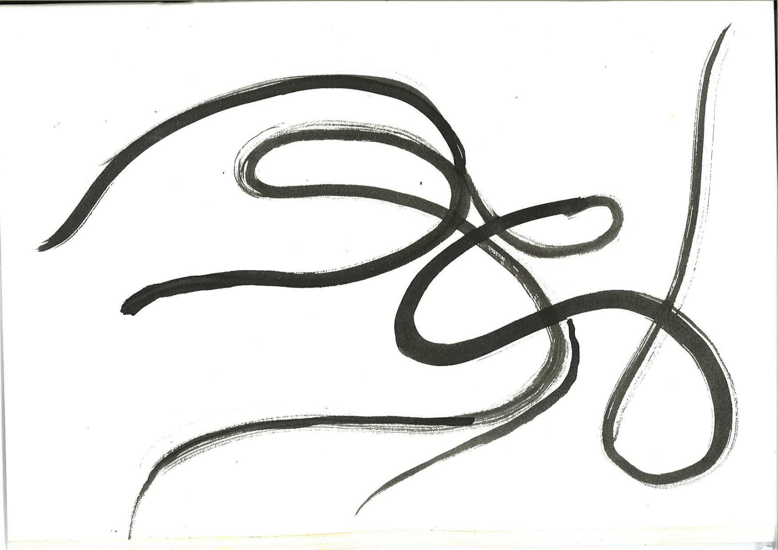
Through the success of the typography stencils(heavy Bass) I have decided to develop it a bit further and as a result the images above are what I have came up with. I have made these images using Ink and spray Paints. I found the ink image to work very effectively and really comes alive within its own right. I felt like after revising the image after for a day, my mind started to fill in the blank space on the page in a very surreal fashion; through peer assessment I found that the image was having the same effect on people, Also through this process I have decided to make the spray painted version but to add in the previous typographical designs that I done earlier. The result was the second image, which I found to work really well in the distribution of space and colours used the main typography "Heavy Bass" is brought out to a better effect, this was one thing I wanted to make sure I achieved in this experiment and believed that this experiment will set a bench mark of what I want to achieve to some degree, in my final design.
However I will be making changes and tweaking the design to give it the best possible finish. The first thing that I will take into account is that is image isn't clear in certain areas and I will aim to achieve this using less of one type of medium to avoid over doing the design.
Magazine name Typography
I have started to use the typography from the magazine cover idea that I had and combined them with hand made techniques such as Stencilling. In this process I have decided to use acrylic, ink and spray paints to make the experiments above and worked into them subsequently. The flat stencil was finished the middle image which is a combination of both forms of text is the one that I found to work the most effective due to the different size of text and the fact that the name of the magazine pops out a little bit more. I found this design to be very eye catching than that of the others. The spray painted lines that fade into the background, separating the magazine name from the other forms of text; as a result this helps the viewer to understand the typography of the magazine and appreciate it a bit more. I am really pleased with these experiments and find that they will help me to create the real thing.
Subscribe to:
Posts (Atom)