In this Project I was asked to develop and Design and outcome based around a retail Store. I decided to based my ideas around the theme of a sports store, I came up with the idea of naming the store Jay'sSportsStore and later decided to modify it to becoming Jay'sSports Limited; because it is a sports store the items that would be sold are sports equipment and Casual Clothing.
I had a Variety of Different of different logo designs that was later developed and scanned in to be finished in Photoshop and adobe Illustrator. Whilst doing this I found that that their was alot more that could be Done to improve the logo I went ahead and live Traced and Live paint Bucketed the final logo using techniques that I have previously learnt. I went a step further and decided to make a Slogan for my Company logo as I believe that this will give the logo a More Professional finish I research famous Slogans from Various Companies such as Nike, Adidas etc. whilst researching these slogans I found that the best of them are always Short and sweet e.g."Just do it" by Nike this works well as all the because it goes straight to the point no excuses just do it. I have also developed and made a Bag for the retail Project this help with the packaging it also had the Company colours just like the other forms of Packaging which made the company look very Professional.
I believe that I have used a wide range of Materials and Techniques, I Have also done the Marbling technique that Developed and was used to Contribute to the Final Packaging designs in the Box. I believe that this Project was an success however it took a while for me to warm up to the Blog and find my way around it, If I could go back and Change anything I would used a wider range of ideas and also make my and used more techniques.
Tuesday, 31 January 2012
Unit 1 Retail Graphics Checklist
1. Moodboard - blog post
2. MindMap - blog post
4. Initial Ideas: Logo - A1 sheet of mounted drawings
5. Logo Development: fineliner (also this and this lesson) - blog post
6. Logo Development: Illustrator - blog post
7. Logo Development: cross stitch - blog post
8. Packaging nets - blog post + completed box
9. More packaging nets - blog post + completed box
10. Packaging Analysis - blog post + hand written analysis
11. Final packaging net - blog post
12. Christmas Homework - blog post + 5 decorated packaging nets
13. Targets - new page on your blog
14. Final Packaging Net + annotation - blog post
15. 6 Examples of swing tags + annotation - blog post
16. 5 in depth analysis of swing tags and Examples of swing tags - blog post
17. Experiments: Swing Tags + annotation - blog post
18. Final Swing Tag + annotation - blog post
19. A1 Final Outcome Sheet - in the draw
Slogan Design with Logo

Swing Tags


Jordan Swing Tag
I believe this swing Tag works well as it applies directly to the Product; it is very informational and has a lot of discriptive Diagrams that explain the Product in depth. All the information needed is on one Tag this Makes it a lot more economical and effective as the point is brought across the instructions are very clear.
Adidas Swing Tag
By looking at the Adidas Packaging the first thing That your eyes catch are the swing tags this is simply because of the colours Chosen which are of high aesthetic value the Front cover of the tags display the adidas logo with very little information attached to it, all 5 tags work well together and display instructions in multiple languages; on one tag there is a Adidas representative in a Black and white photo this may be used to represent History and to show some sort of culture in Adidas's development. the Tags have got a down side and that is there are too much of them for one item even though this could show a form of power as it is a big brand but it is still not economical and this could only contribute to Global warming and cause problems for the environment.

Dunlop Swing Tag
The dunlop swing tag is a Very simple swing tag that gets straight to the point about what it is promoting, the country in which it is mainly based and displays information on how to take care of the product bought, I believe that this swing tag works well as it is highly economical the expenditure is minimized to maximize the profit made by the Company. For My swing tag design I hope to keep it simple but make it Bold and eye Catching at the Same time.

 New Balance Swing tag
The new Balance Swing tag has a sleek yet unusual style for it's swing tag it is a metal Chain with a rubber tag that displays the information about the product being displayed , I believe that this tag is too minimal as to what needs to be display there is little information available the information may be displayed somewhere else but this will cause problems if a Costumer sees this product on the shelf and needs information which may not be provided.
NIke Swing tag
the Nike swing Tag has a very stylish design which is like a keychain; it also has a very catching Message "World Famous" this phrase applies directly to the fact that Nike is a well known and also highly used brand around the world the swing maybe used by individuals on Keys, Bags etc. because of this nike is endorsed causing more people to see the tag, like it, and go out and buy an Item of nike of their own and the cycle goes on and on i believe that Nike's Swing tag is very Stylish and also very Clever by the Designer as this tag will cause more people to buy more nike stuff and to keep their swing tags as it can be used elsewhere for other uses.
Swing Tag Final Design


These are My Final swing tag designs which is an Improvement to the earlier version, these tags are much more eye Catching they are in the Primary company colours. where the swing tags were Made and information about the Company's headquarters are displayed with high visiblity. I believe that this Design works well as all information that is needed to be displayed has been displayed, my Target was met because I Limited the amount of tags that will be used because of this my company will be more environmentally friendly and effective as its point is made clear with 2 swing tags.
Net Packaging Final Design


Slogan Analysis
Nike "Just Do it"
NIke Slogan
The Slogan Came about from the Last words Spoken by Gary Gilmore Before he was executed which was "Let's DO It" this was then Changed to Just do it. The nike Slogan was Chosen as 1 of the top 5 most recognised in the 20th Century which is also Shrined in the Smithsonian Institution. I believe that this Logo works as it explains what needs to be done Just DO it no excuses, No ifs, No buts, No maybes; by seeing or hearing the Slogan you instantly aim to Achieve the very best of your ability Without a doubt even if you didn't win you will be better than you was wearing the Nike knowing the Slogan is Just do it.

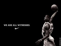
Lebron James (Via Nike) "we are all Witnesses"
LeBron James Slogan
Lebron James has had this Slogan/ Saying from he was a young Boy he has also Tattooed the word Witness on his leg the Slogan just just a reminder of his Skills on the Basketball Court as when ever he plays he is saying you are about to witness something Great i think this works as a good Slogan as people who buy the shoes will believe that they will produce something great that is worthy of being Witnessed. The Basic feeling makes people feel Better than they actually are and would become better if they wore LeBron's Shoes.
 Adidas "Impossible is Nothing"
Adidas Slogan
The slogan impossible is nothing makes you wanna work hard this slogan will more likely apply to someone who is going through a difficult

Michael Jordan's Air Jordan Brand of shoes(Via nike) "Become Legendary"
Michael Jordan Slogan

NIke Slogan
The Slogan Came about from the Last words Spoken by Gary Gilmore Before he was executed which was "Let's DO It" this was then Changed to Just do it. The nike Slogan was Chosen as 1 of the top 5 most recognised in the 20th Century which is also Shrined in the Smithsonian Institution. I believe that this Logo works as it explains what needs to be done Just DO it no excuses, No ifs, No buts, No maybes; by seeing or hearing the Slogan you instantly aim to Achieve the very best of your ability Without a doubt even if you didn't win you will be better than you was wearing the Nike knowing the Slogan is Just do it.

Lebron James (Via Nike) "we are all Witnesses"
LeBron James Slogan
Lebron James has had this Slogan/ Saying from he was a young Boy he has also Tattooed the word Witness on his leg the Slogan just just a reminder of his Skills on the Basketball Court as when ever he plays he is saying you are about to witness something Great i think this works as a good Slogan as people who buy the shoes will believe that they will produce something great that is worthy of being Witnessed. The Basic feeling makes people feel Better than they actually are and would become better if they wore LeBron's Shoes.
Adidas Slogan
The slogan impossible is nothing makes you wanna work hard this slogan will more likely apply to someone who is going through a difficult
Michael Jordan's Air Jordan Brand of shoes(Via nike) "Become Legendary"
Michael Jordan Slogan
Packaging Design


These are my developed ideas that will go towards Making my final design. I found that these designs worked well however there was something missing I went back and found that the surface area on the shoe box, which is marbling, didn't appeal directly to the design also the colour scheme of the swing tags brought down it aesthetic quality.
Packaging Development and Templates


These are some Packaging fastenings that I produced and assembled whilst experimenting with various media that will grow into my final design for packaging. I found these templates to be very helpful as to what I would need to do the make the Packagings on my designs and which method would suit my design in the best possible way.


Final logo designs


For my final logo design I have made a few Changes , the Most noticeable is to the Colour Scheme of the two Logos I found that the selected colours which are Red, Purple and Yellow/Gold works well with my Design I have also chosen them to be the Primary colours of the Company I believe that my designs work well because of their originality. For both of my Designs I have Sketched them out first, developed them, subsequently I Scanned them onto the computer and used Computer Aided Design via the methods of Adobe Photoshop and Adobe Illustrator to produce these outcomes; before arriving at a final piece, after I have scanned in the designs I cleaned them up and Transfered them to Illustrator where they where live traced at this point I faced adversity as the tracings weren't complete; meaning that there was gaps in the designs because of this I had to go Back to the begining and used the pen tool and very carefully go around the design Manually to fill the gaps in both designs, this was successful and i was able to add colour to the designs using the live paint bucket which made a successful outcome.
Subscribe to:
Posts (Atom)