Thursday 20 December 2012

Sketches of Buildings from Primary and Secondary Sources


(The Gherkin in Photoshop)

I have decided to add sketches of buildings that I will use to design and develop my Outcomes as having these elements will add to the artist and his character as he makes references to the city, a cold world, concrete jungle etc in his music. Having these sketches will add a little more interest to the design sometimes I find that a single structure always helps to draw interest with viewers and makes the cover a bit more eye catching and as the product is a magazine  this is the type of things in the visuals that will draw more people in.

Wednesday 19 December 2012

Photoshop experiment with Primary Sketches


I have Brought My design Into Photoshop and used a few of Textures that I have photographed and scanned on to the computer. And made the designs possible using Adobe Photoshop. The design is made up for Primary sketches from Secondary Materials, Textures and Computer Aided design. I have used the texture designs and implemented them in the design using a number of layers to give the effect that I wanted. The colours and fill effects were done using the airbrush Tool in adobe Photoshop using various colours that compile to make the skin tone on the Artist the Lightness that shines through the image comes from the surface textures in the design. I will develop this design idea by experimenting with the medium and adding  more to the overall image with patterns, more textures, Sketches and Primary photos. However I do believe that this design works well due to the powerful single image of the artist and the fact that he is not facing forward makes you think, why is it positioned in this way? what is he looking it at ? small things like this sparks and interest in the cover and would incourage more people to look at the design.

Tuesday 18 December 2012

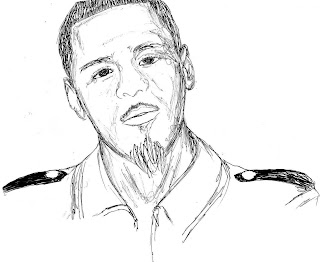
J cole Sketch Development

I have experimented using a combination of hand made sketches and computer aided design through Adobe Photoshop. and filled in the colours of the skin tone and facial features. I believe that this works well and a way on how I will improve it is by adding the textures that I have collected to create an outcome that would have elements of Andy Potts and Miiles Donovan in the design.

Monday 17 December 2012

J Cole Sketches


I have done some sketches of the artist and scanned them in and cleaned them up in Photoshop. I will use these sketches to experiment with and create image outcomes. I believe that this will make a Link to Tim Marrs' work as he uses a combination of handmade images and photos to create his outcomes. I have chosen to keep these studies quite Sketchy as it will help with making the outcomes in a illustrated way.

SurfaceTextures


I have taken 5 different surface textures that I will bring into photoshop along with my other elements of design to get a feel and play around with the different techniques and methods as this will help me when I create my final outcome

Thursday 6 December 2012

Magazine Experimentation

This experiment was done using Adobe illustrator. I have made it using the pen tool as the pen tool to go over the image of the artist and subsequently used the live paint bucket tool to colour in the shapes to create the make up of the artist's face. I then brought the image back into Adobe Photoshop to add the typography and necessary information that would be found on the front cover of a Magazine.
The webpage is my blog and the QR code leads you directly to the blog. I created the code using Barcode Generator - http://www.barcode-generator.org/ I found that this intial experiment works well as it gives me a better understanding of how to make a magazine cover, I believe this will help me to further my Ideas when it comes to the making of the final piece. 


Wednesday 5 December 2012

Primary Experiments with secondary Material


I have used and image of J. Cole and experimented with it in Photoshop to play around with the effects and used it as a way to develop a illustrated magazine cover.

Monday 3 December 2012

Magazine Name

The name that I have decided to give my magazine is Heavy Bass due to the Feedback and peer assessment that I have done with other Student and an older audience to get the best of both and Heavy Bass sounded the best and could apply to all genres of music quite easily.

Wednesday 28 November 2012

Myles Donovan Analysis


I really liked the images of Miles Donavan in many ways the main of all is how well it relates to the theme and type of work I hope that I will achieve in this project. The magazine Pages have alot of illustration on them they are also over loaded with information, images colours however the page is not jumbled and there is a form of stability achieved making a balanced page. In the making of my magazine cover this is one of the main things I have to consider and keep in mind as having a balance page makes the magazine more eye catching and creates a better viewing experience. I really like I use of colour in all the examples I like the Monochramic red  example the most as the still has elements of the original image however the features are brought through the use of brush stroke and direction it reminds me of cloudy smoke of some sort. I also like the N.W.A piece as it relates to hip hop music and the items and techniques are all representations of Hip Hop, in my designs I will try to bring in symbolic items to the artist/HipHop/Point that is being put across. just like in this piece the Beats headphones represent the music the NWA was a famous hip hop group that helped its growth the record it the background represents the DJs mixing up different sounds and songs and  the stencils and spray paint represents the tagging in hip hop culture. I really liked these ideas and will continue to gather and experiment with these techniques to create and develop my ideas.

Andy Potts analysis


The Style of Andy Potts and Tim Marrs have similar Traits, I believe this because they both use a large selection of images that have been overlaid to create one image. In Andy Potts' work there is a much Brighter, vibrant range of colours used in the images with beautifully illustrated designs and silhouettes. I really like the way that the images are laid out, the is alot going on in the images however the meaning is not lost and the posters are relevant whilst creating my idea I have to keep the ideas and design creative and relevant to what I am trying to achieve without losing the image in the process. The blending of the images are amazing to look at it shows the sheer skill and thought process put behind the image before creating the outcome it makes you take a 'Chess' like approach as you need to know the next step before you even make the first one.
The Typography in the images are balanced out in a way that that the images can be seen clearly and the text is easy to read and still very noticeable.  I believe that these ideas and examples that I have reviewed will help me to create my own ideas and designs to a high standard it also shows that the simple things done brilliantly are just as effective if not better than some complex designs and this is something that I will try to keep in mind when creating my own designs.

Tim Marrs analysis


Tim Marrs' work in these images are styles that I would love to experiment with and take elements from to create my Magazine cover. The pieces present beautiful illustration with a wide range of colours and interesting imagery. In the images above there is alot of images overlaid and altered to create the outcome, however by doing this the image does not appear to be over crowded and the artist achieves stability by not over crowding or adding too much of the same media in one area. the typography and the image works in complete harmony with one and other; the words are blended in a way that they really become apart of the image. This is something that I have to pay perfect attention to at all times as I will be making a Magazine cover and the cover story, and if the typography doesn't work well with the images then the magazine will not have great effect on a wide target audience. The colours used by the artist are blended and molded in a way to to make the images seem-less and quite eye catching; because of my choice of outcome this is also a area that I need to focus on when creating and developing my ideas. I found Tim Marrs' work to be very interesting, eye catching and in some way new this is why I think that trying to keep a close link to the style of this artist as it is not the norm of a magazine front page will help me to develop my ideas to create a very interesting design.

David Downton analysis


This artist was one of which I have researched externally and found that there is a directly link to my brief in some of his images and magazine projects that he has done. The main technique used in these front cover pages is illustration the artist uses quite sketchy and painting like techniques on the images I think this works well as the use of  colours blended repetitively to create tones in areas of the image breaks it down and gives it an animated effect, his hard lines created through the use of the negative space works well as it brings out the person in the picture which gives it a sense of power. The typography and the images are molded together in such a way that it creates a balance page I believe that this is one key factor that I need to consider in my approach to completing this project and designs, as small mistakes like this can be vital in the making of the final product.
I found that these poster work well and their hasn't been a large colour range, some only have a small amount of colour in areas of the image however the result is made to be perfect on the page and the end result looks aesthetically pleasing. This technique is a reminder to me that the simple designs can be just as effective as those that are highly complex.I really liked these designs and could like to take elements from them as a go along to create my own outcome. I found the design to be so effective as there isn't too much to look at and would take that into consideration when I am in the position of making ideas.

Moodboard

Tim Mars: 1, 6
Andy Potts: 5 
David Downton: 7, 10
Miles Donovan: 2, 3, 4, 8, ,9 


Monday 5 November 2012

Final Packaging and Evaluation


I am really Pleased with the outcome that I have made for this CD package as it turns out that the design that I came up with was completely original and has unique Values in the way how it has been made the colour scheme was adapted to suit a J.Cole album the typography on the covers have a musical theme to them the wiry lettering flows from one letter to the other. The necessary information was presented in the album very well the two images front and back were presented to a High Standard and the Casing was produced with a Professional finish. the initial design ideas had a big part to play in how the CD packaging was suppose to be made both from the book and ideas Shown  via the blog the circular shape of the basketball hoop design made me want to use a circular design the enclosed rose package made me think about putting them into layers and from then I started to Sketch out the ideas and added more details that subsequently lead to this one With all been said, making this design wasn't a easy route as there was a lack of equipment available to me one site therefore I had to find a means to cut the Circles out  of site this opportunity came about at my old high school where the initial CAD for the Circles been made. I had to make changes onto how the CD and the Poster will be housed inside the packaging the biggest change from the design was to have the CD and the poster to sit inside the blue rings and not be on top of each ring the reason for this was that the gap between each layer wasn't enough and it would cause the layers to produce friction between each other inevitable making it harder for consumers to used; and the addition of the blue ribbon acts as an ergonomic aid for those who can't lift the CD out without having problems. Another problem aroused once the discs were cut and that was finding the right rivet to fit with in the 5mm hole in each disc to hold them together through using various methods I found the one that fits in the best with the design I spray painted Two metal tacks and wrapped a 4mm cyclinder shaped stick of wood with tape and forced it through the 5mm hole and glue the inside of each tack so that they can stay together whilst allowing easy gliding to get to each layer of the the packaging. If I had the opportunity to do this design again I would of found a way/means to print the image onto the plastic transparently as I believe that this would give the design a bit more of a wow factor, as doing this will reveal little bits of the physical CD under it however using these methods would be very expensive to create a one off and would require specialist equipment that I have no knowledge about or its whereabouts, I do love the design how it is. If there was more Time I would of made this casing as the Deluxe Version and made a more simpler store shelf design as the standard copy. Overall I do believe that My design is Unique completely original, one of a kind design and I take pride in the outcome as it represents so much more than just a CD packaging, it was a Struggle to create it but it was all worth it in the end and now I can feel more confident heading into the next Challenge that lys Ahead.
I made a change to my in lay instead of putting a poster for the consumers to put back together I found that it took people a while to figure out what the poster actually was. I decided to make a song booklet that had the lyrics it was made using the same rotating system that the case has; the lycrics where made using the same typography as the front cover/ CD I found that it work even better than the CD poster and related alot better to the packaging to fill the gap to this final outcome.


Cd poster

The Poster for the design yet again shows the artist in the studio working on the next hit. This effect was an effect that I had great success with in my Chris Brown Tigers' head image I found that it works well with the meaning of the album. The effect gives the impression that its been a long day in the studio the artist looks as if he is slouching this is the other side of him you hear a lot about in his music the colours around him are very dark and he stands out because he is shining in the light due to his hard work and dedication.
the Circles in the picture are 120mm the same size as the CD itself as it sits beneath the CD in circles and is like a puzzle to be put back together the recreate the image. It also acts as a padding to lift the CD into place so that it fits into place with the top blue ring.