Friday 16 March 2012

Paper installation Group Activity


This is the outcome from My groups paper installation that we have made in response to the Sydney Opera Installation that we have researched the idea was to make a Holiday destination. The installation was made from tracing paper, card, Acrylic paint, Water colour paint, sugar paper,masking tape and pieces of string. Towards the end of the installation we decided to relate it to David Shrigley by adding random pieces and a bit of humor to the installation such as the Giant man  and the Sun with shades, I believe that this installation is very eye catchy and it makes you wonder about the figures that are out of place it is also very unique as it brings something different to the table and also makes you smile. 
I Believe that this installation works well considering the Time limit that we had and the Limit amount of Materials that were available to us, the hotel needed a bit more work to bring up it's aesthetics I believe that more features such as doors, windows and a sign for the name could help to give it a better finish I believe that this piece can develop into and idea for my final Design because of the possibilities in terms of outcomes that it can develop into.

Sydney Opera Art Installation Analysis


This piece was designed and created by Darcy Prendergrast and a group of friends for Staples, it is a replica of the Sydney Opera house and it's surroundings which is made completely out of Stationary that can be bought in the store. The reason for this Installation is that it was a part of a TV advert that enables you with the Chance of winning a Trip to Australia hence the reason for Sydney being their choice as it is a main tourist attraction. there is a wider Range of Materials being used to create this installation such as post it notes, paper clips, staples, cardboard, cards, Paper, pens, pencils, elastic bands, string, erasers, crayons, glue, felt tips, markers, rubbers and tip-ex. The piece of work is very accurate and whilst looking at it there is and instant recognition as to where it is replicating it is very unique and shows how far 1 can go with simple very day stationary materials. I believe that this piece works well because of it's complexity in terms of using solid Stationary materials to create a miniature version of the real place there has been alot of time and effort to layout this installation before making it, its structure and the materials work well to create it's designated areas; it shows versatility and originality as the artist has gone beyond the expectation of his audience. I believe that the intensions of the artist was to amaze their audience and show how far you can take a simple object and develop an make it into something spontaneous.   

Research of Possible cities for My Illustration

                                      Barcelona City 
                                     New York City 


These are the 6 holiday destinations that I have decided to research and record that will be used to develop ideas for my illustration Poster design. I have chosen a mixture of Tropical and sub Tropical destinations the as they bring a mixture of different aspects to the table e.g. New York holidays destinations will provide areas to Shop, Scenery and wide range of luxury Hotels to enjoy where as in Negril it is a lot more remote holiday destination which brings  the fun directly to you, it is far away from other forms of civilisation and Shopping malls as a result you can only do what is available at the resort.


In depth Poster analysis

This poster was designed and created By David Klein for TWA Jets Promoting the company and attracting people to visit New York city. The image is made with original Gouache and mixed media, it is made up of Typography and one of the most famous Landmarks in New york; the Statue of Liberty. The piece has very bright vibrant colours and is made up of  Typographic words in different shapes, sizes and different fonts, they are all places that may be of interest to those visiting New York City. The image is made from a drawing and paints, this may symbolise New Yorks rich culture of art. the Typography looks very organised even though there is a lot of it I believe that this could symbolise the organisation of people in the City that never Sleeps. I believe this poster works well because of it's structure and lay out on the page the artist has thought about each individual aspect and found the perfect way to make it come together on the page. by not using a actual image of New York city after looking at this image it leaves you with a cliff hanger ending as it makes you wonder about the attractions listed such as Lincoln Centre, Columbus Circle etc. this really makes you want to research these areas and eventually makes the viewer visit these areas.
I also believe that the colours used in this poster help to give it the effect it has on viewers, the Gouache paint intensifies the brightness of the colours and draws the attention of the viewer as this happens the are indulged in the painting which  draws there interest.
I believe that this image would work better if there was a hint of what the buildings and the scenery is like,  as there isn't any reference to them people still don't exactly know what to expect until they research it further because of this more thought would have to be in put into the holiday choice and this would cause people to change there minds as it would be too much hassle. 

In Depth analysis of Postcard

This is a Post Card about Montego Bay, Jamaica. Montego bay is one of the main Tourist attractions in Jamaica because of it's Clear beaches, cuisine and tropical weather. My First reaction to the postcard was that it is very aesthetically pleasing as it shows the sea front washing the shores, the bright vibrant colours of the buildings and a clear sky, in the post card there are various activities visible which includes a ferry for tourist. The colours used are very warm and inviting almost asking the recipient to come and take a visit enjoy the scenery of Montego Bay, the roads at the time of the photo are very clear this also makes the viewer believe that their destination is quite making it easy to get around and have a quite holiday; the image itself is very calm and relaxing promoting a peaceful holiday.
The aim of the postcard was to make others feel drawn to take an holiday to this destination. judging by the photo is present a Calm, easy going, peacefully and resourceful holiday showing that you can get a lot of fun activities done enjoy the scenery and meet the Locals. The buildings in the photos are a mixture of  Modern contemporary and Traditional styles this shows that although the area has moved on in terms of technology there are historical buildings and landmarks which helps to gain an understanding of the history of the island.
the Image is a still shot Photo I think the reason for the artist choice not to photoshop or develop the image further was to show the beauty of the island everything in the image is perfect therefore unnecessary editing  with the image will ruin it.
My personal response to this work is that it works very well the aesthetics are very good, the presentation works well because there has been a lot of thought gone into making this postcards it appears to be a simple photo however without the presentation the postcard wouldn't be complete. 

In Depth analysis for Letter set


This is a letter set that fits into the theme of Travel perfect as it is based on New york in the famous central park. straight way the impression I get from this letter set was that its audience are for tourist who are visiting New York. The letter set is very colorful and is made in a cartoon style this instantly makes you think of New York as a fantasy world attracting you there to see what it is like up front for real, in the picture on the letter there are people in the park doing various activities such as walking that makes you think of the saying 'The city that never sleeps'. their are also taxi's in the picture which symbolizes the constant rush busy New Yorkers face but also it shows the contrast between calm and peaceful easy going lifestyles and also hectic busy lifestyles that are in New York.
The aim of this letter set was to present New York's Lifestyle and portray it's famous landmarks. They also are trying to get their audience to visit New York their are little hints such as 'Central Park' the name is going to make you remember New York and build a form of bond to the City as there is so much going on in the picture it make you want to live a day in the New Yorkers shoes.
the letter set appears to be drawn and finished in Photoshop to give it's graphic effect. I believe this works well because it applies to all age group and has a wide target audience because of this, I also believe that it not being a photograph will help to persuade people as they would be more anxious to see what it actually looks like.
overall I believe this letter set is very successful in terms of the message it is trying get across also i believe it is universal as it applies to everyone and is very simple and easy to read.

Paper Installation Review Sheet

On these review sheets I have described the potentials, limitations, advantages and Disadvantages that using paper can lead to. On the second sheet I have analysed the Sydney opera house installation as shown in the picture.

Thursday 15 March 2012

Observational Drawing Still Life


These are my Observational Drawings from still life objects I found that drawing these objects varied in difficulty as the go from very little detail to intricate pieces the mark making had to be varied to create the same textures and appearances of these drawings. 

Tuesday 6 March 2012

Travel Related Tickets


I have collected and scanned in 4 travel related tickets. the Tickets are two electronic oyster cards that are used around London where ever there is a electronic oyster reader these are found on most Transports for London such as Buses, Trains, Trams etc. There is a Train ticket and a Drivers Licence which is needed to enable legal drivers 

As Graphics Trip review


The Graphics trip was very interesting as it helped to develop Ideas for the illustration brief, before I got to the exhibition itself their was work of the artist outside in the surrounding areas which included various Typography and illustration posters . The exhibition I enjoyed the most was that of David Shrigley, even though his work was at Times Literal it had a sense of humour to it .e.g. Poster of the missing Pigeon with no name. David Shrigley's and Jeremy Dellar are two complete opposite artist in terms of use of colour and meaning in their outcomes take seperate routes I found that Jeremy Dellar's uses Colour and realistic pictures and objects e.g. There was a Person to represent his I love Melancholy piece who was sat on a Sofa reading books whereas with David Shrigley the images were humorous and very Literal at times both exhibitions made you think about possible techniques that you could use and develop for your final outcome because my  exam brief is based around Post cards  I believe that the techniques used by David Shrigley would make more successful outcomes because of the humor and doodle drawing techniques I
believe that using David Shrigley as a inspiration would help me develop ideas
and create unique outcome that are not the norm.


Landmark Drawings


These are my Sketches of Landmarks from Cities around the world. These Landmarks are perfect to develop from as the have pleasing architecture to them, stunting curves and shapes I believe to make my final outcome look as interesting as possible I will try to integrate these methods into my own work and possible use view points to make my work look more pleasing. I believe a lot can be done with the sketches in terms of how they are presented and what they can be developed into; for the development of my ideas I want to create a variety of different outcomes from different media that are simultaneously linked for the exam

collected Postcards


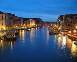
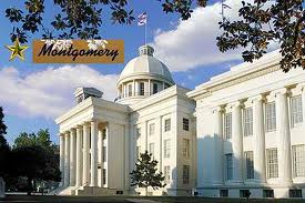
These are examples of postcards from different cities around the world. I have collected these to show a variety of natural environments and those with aesthetic Architecture. I found these postcards work well in expressing the city's culture e.g. the Wailua Falls represents a calmness in the environment and people that live there the green Plants and waterfalls in the background could be symbolic to the lifestyle and mysteries that you may come across in a visit to this destination.