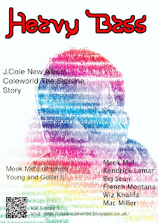
These are the images that I have produced for my final design I have adjusted the tones in the typography images so that they are not as bright as the previous design. I really found that they work well together and as a front and back page for the magazine that will represent the artist's new album as it features the artist and his lyrics with the design. It is made clear what the main story of the magazine was going to be this is something I thought about as I thought it was lacking in previous designs. The structure of the artist's face still has visibility which helps you construct an image with in the typography. I do believe that the design is complete at this stage however the text does not work with the image on the front page this is something I will have to re consider and take action to improve to create the final outcome.


No comments:
Post a Comment