Showing posts with label Javari Cameron. Show all posts

Wednesday, 9 May 2012

Graphics Poster Evaluation


 These were my Final outcomes for the 8hour exam they were inspired and developed with the background of Various artist such as David Klein, Chris Dent, Andy Potts and various methods that I have developed myself using Tutorials at a earlier stage I also found that The Time that I was wary of was more than enough to make the 5 designs as I prepared myself very well going into the exam with all the materials and knowledge of what to do I did face some problems with the Time of the Lino Printing however everything else came easy to me as I had a lot of practise and was on auto pilot for the other posters I did make changes to improve some posters and found that it really helped with the overall design. Making a Time keeping sheet to make the most of the Time and had various Checkpoints every 30 minutes made it less stressful and made better use of the time I believe that this was the main reason I got through all the Posters in the Time available . I also believe that because I have experiment with a variety of materials and mediums I was able to extend my chances of being successful with these designs e.g. if I hadn't experiment with the Lino cutting making it would take a lot longer and If I had'nt known the knowledge of the of the inks long drying time I wouldn't of made it with less ink to reduce the drying time I believe that there could of been changes to make the design better In many ways such as more detail in areas less going on in some images but overall I believe that it worked well and if it was done again the outcomes will be of higher standard

Monday, 7 May 2012

Exam Planner


This is my Time sheet for the 8 hours of the exam is also shows the materials that will be needed and as I will be making 3 outcomes using CAD methods this requires the mac Access to be needed in the whole exam. If I stick to this time sheet and meet the checkpoint times I have given Myself I will give myself the highest possible chance to make all the outcomes to a high standard without the outcomes looking as if they were rushed.

Poster Names

I have decided to look into the names of the 5 poster series and came up with:

  1. Play London
  2. discover London
  3. Travel London
  4. LDN
  5. About London Town
Each poster name will fit directly with the poster it is assigned to. Play London will show a Day out on southbank with the London eye this will be designed using lino printing. the 2nd in the series 'discover London' will be developed using a 4 colour stencil this will be taken from a image I have collected of the tour buses in London. travel London will be developed using the techniques that I have developed in Photoshop. LDN which is just a shortening for the word London will feature multiple Landmarks using the techniques of Photoshop. The final Poster about London Town will be developed using sketches to produce a hand drawn outcome.
The fonts that I will go with needs to be simple as this will cause some form of equilibrium when it comes to the overall posters aesthetics, if too much is going on in the image then it wont work so well.
these fonts are :
Olde English - Dafont.com
Old London - Dafont.com
Boarder - datfont.com
London Underground Font - Fontspace.com


Friday, 4 May 2012

Black and white effects on Photoshop


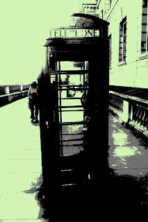
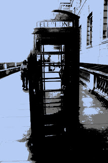
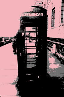
 I have developed these effects in Photoshop using two Layers one being the actual pics and a layer filled in grey that is applied to the colour effect to give you a Black and white image then I used the eraser tool to rub away t.he grey areas that I do not want to reveal the colour underneath.

experimentation on Adobe Photoshop 3

Electrifying Poster design Tutorial
the first step I made to making this Poster was to use a tabloid sized document in Photoshop I then used a gradient fill in a Radial style scaled to 150% in reverse, I then reduced the opacity of this layer to 75% and created a new layer I then created a new gradient adjustment layer and customized it with 2 colours of my own which where directed at a 45 degree angle and reduced the opacity of this layer to 25%. I then Placed the image of the Taxi as the taxi had a complexed background I used the Magnetic Lasso tool to pre-cut the image and used the refine edges tool overlayed the Image to give the smooth edges of the car and wheels I added a Layer mask to the image, I saved the image them file placed it into Photoshop on the poster I scaled the image a suitable size for the poster. I then created the diagonal bars by creating a new layer, then selected the rectangular marquee tool and created a selection and filled it with black I then went to edit transform and skew; with this tool I used the top middle selection and skewed the bar to the right, I then went to edit transform and rotate, whilst holding the shift key the rotation was done in 15 degree increments I chose a suitable rotation for the bar and made a brush with the bar by going to edit define brush and named it to diagonal bars I then deactivated the selection and deleted the layer.
I then created a new layer and positioned it under the layer of the taxi and named it dual diagonal bars I then selected the brush tool and selected the brush that I just created I went to window brushes to show the brushes pallet I ticked the shapes dynamic option and set the size jitter to 100% and I did the same for the scattering option i began painting with a foreground colour of black in the way that I wished to. I added a gradient to this style by selecting the layer and going to blending style I then chose Gradient overlay and selected  a spectrum effect then the angle to -45% and scaled it to 150%. I then created a 3D version of the diagonal Bars by creating a new layer and positioned it as the top layer and named it 3D diagonal bars, I then set the foreground colour to white and painted some bars I then held the control/command key and clicked on the layer to get a selection of the bars I then went to the paths pallet and  created a vector path using the selection afterwards I when to 3D and Repousse'd the selected path I then rotated 3D object made to my liking. I set the lights to CAD optimize and adjusted the depth to reduce the thickness of the 3D layer. I then went to layer, layer style and gradient overlayed the 3D layer and set the gradient to spectrum and scaled to 150% I adjusted the angle setting to the direction of the diagonal bar I clicked and dragged directly on the image to get the colours I wanted from the spectrum selection. I then went to colour overlay and set the blend mode to overlay and used a colour of my choice. I then rasterized the image by bring up the 3D window and used ray trace final after this process I the clicked on the layer and rasterized 3D and positioned it under the layer of the girl I put these effects into a group by pressing control/command G. I the held the alt/option key and duplicated the layers as I dragged it. I then named this group to 3D diagonal bars I then selected the Move tool and moved it into the position I wanted; I then converted this into a smart object by going to layer smart object and converted it into a smart object. I then went to layer new adjustment layer and brightness/contrast and check-marked the use previous layer to create clipping mask I the used the legacy of the layer and set the brightness and contrast to 50. I then created a new document to 100 by 100 pixels and selected the rectangular marquees tool and set the option to fixed size ' width to 100 percent and height to 25px'. I made a selection and filled it with black I then duplicated the layer I then used the offset filter and made the vertical setting to 50. I then used the crop tool to rotate the image 45 degrees and dragged the sides to the document edge. I then went to edit and define pattern and set the name to diagonal interlace, I then closed the file without saving it and selected the ellipse tool and set the shapes style to default/none I then selected the ellipse option of using a circle and created one on the original document
I the clicked on the layer and chose blending options and set the fill opacity to 0% I then went to pattern overlay and set the blend mode to screen and selected the diagonal interlace pattern that was created. I adjusted the scale to suit the image and renamed the layer to interlaced circles. I then added this to shapes after clicking the ellipse tool and drew a few more circles. I then duplicated the layer and placed it under that  taxi and added more cicrles and reduced the opacity of these layers to add transparency I then created a new layer and named it star filter and positioned this layer above the blending fill layers and changed the blending mode to screen and filled it with black I then selected the brush tool and brought up the brush pallet and enabled the shapes dynamics and set it to 100% and scattered it to 1000% painted in the areas that I wanted the star filters and duplicated the layer (command J), I then used the motion blur filter and set the angle to 45 degrees and adjusted the settings to give a suitable motion blur. and repeated this filter by pressing command F, I then selected the other star filter layer and applied a -45 degree angle and repeated the filter afterwards I merged the layers and named it star filter I then sharpened it by going to filter sharpen and used the unsharp mask tool: I made the amount 200% and adjusted the radius accordingly. I then created a new photoshop document of 10000 pixels by 10000 pixels I selected the rectangular marquee tool and set the style to fixed size width to 100% and height to 100px I created a selection I created a new layer and filled it with black I then went to edit free transform and clicked the triangular button before setting the Y axis to 10000 pixels then I  went a stepbackwards the I pressed control/command alt shift and T 9 times then I deselected the selection I then went to filter distort and polar co-ordinates and set the mode to rectangular to polar I then made a selection of the entire document and transfered it onto the original document, I then skewed the new layer then scaled it to the image and rotated it the way I wanted it. I moved this layer below the girl and set the opacity to my liking. I then used a gradient overlay on the shape and set it to spectrum. I then added a star flare to the document, first I made a new layer and filled it with black. I wenty to filter render and lens Flare and set the brightness to 100% and chose movie prime as the lens type and positioned the light in the middle I then used a gaussian blur filter and adjusted the radius until the blue line disappears I then went to edit free transform and set the height to 10% then I went to edit free transform and rotate and set the angle to 30% and changed the blending mode to screen and pressed control, alt, shift and T 5 times and the star flare is created i will merge the lens flare one document and set the filter to screen. I the used the Hue saturation tool and colourized the flare and set the hue to 200 and the saturation to 100 and duplicated the star flare and set the hue on this flare to 180 and erased over areas that didnt need the flare with a black foreground.
And That is how I created this poster.


Thursday, 3 May 2012

experimentation in Photoshop 2

I have used an image that I have sketched out to make my  Chris Ede inspired Illustration. The first thing that I have done is to make a duplicate of the layer as a safety layer I then filtered and cutout the image I selected the colour Range tool and selected the shapes and made them purple; I then went on to delete the background and made a new layer which has the maps of London made up of small circles to do this effect I got a picture of a map of London reduced the transparency and edited the brushes to create the effect that I wanted. I found that as this study developed I went in a different direction than that of Chris Ede, however I do think that this study can Progress and develop into a more successful outcome. although this was a quick Study it made me think of new ideas and was to make a final outcome whilst using photoshop, I found using the tools in this form of CAD is becoming easier and more Time efficient this will be a key factor that needs to work in My favor when I am making 5 time consuming posters.

experimentation in Photoshop


I have had a go at making a Miles Donovan inspired piece and went ahead from just a simple 3 colour to using four colours in one experiment. this study was made by using a photo that I took as developments for the final posters. I have used a photoshop techniques to develop these outcomes; I started by making a copy of the original image in photoshop and selected the top  layer only, I then adjusted the threshold on the image oppositely to the duplicated layer making one light and 1 dark, I then used the hue and saturation tool to get to colours I wanted , and this point I was trying to get rid off the background so I went to select and selected the colour range tool and selected the white background and deleted it from the image .  I went a step further and made a new layer and filled it with the colour of my Choice for the 4 colour stencil I then saved the image as a jpeg re opened it into photoshop and added new colours in the places where it needed to be.

Sunday, 29 April 2012

Development Photos

I have went on to collect some more images of Famous London attractions Culture and notiable landmarks whilst doing this I found that it drew me closer to those that have been photographed and also that of the buildings involved. It makes you stop and think who they are, what their lifestyles are, in terms of the landmarks it makes you wonder how they where made, who's the architect, what difficulties the builders faced. I found this with most the buildings and Landmarks in London it makes you think deeply into the history behind it and I discovered this whilst taking pictures as a result of this making posters with these images will give my outcomes that much more meaning it will also make the viewers think a little bit more deeply in trying to find a Meaning.

Saturday, 28 April 2012

Proposal for exam piece

For My exam piece I hope to design and create 5 posters around my chosen city which is London as I have access to this city very easily. I hope to create these posters with a variety of different materials and mediums. each poster will have its own meaning to it e.g. Work London, Play London, Enjoy London, View London and Hear London. each poster will be based around the theme of the word it is given. there will be a series of designs created that have London Landmarks and properties exclusive to London that will be recognizable in the designs.The techniques I hope to take forward are Lino printing, Computer aided designs in Adobe Photoshop and Illustrator, Line drawings that are finished in Illustrator and a form of 3D design which maybe be tangled 3D or of that which can be seen in 3d with 3D glasses. I hope to make my designs in a way that it makes the viewer stop and take a moment to appreciate it and ask questions on how it is made. I will be experimenting with these designs and techniques to help me prepare for the Exam as it will not be easy to create all these designs in the short space of time without practice and precision to time keeping.

Friday, 27 April 2012

Intial Ideas


These are my initial designs whats important about these are the Artist that I have looked at and developed an interest for. For the development of my Ideas I wish to make more than five different outcomes to develop my ideas that I can then take forward for my Finalised designs I found that these tasks where free to my design even though I have developed them using another artist. these task where very time consuming and I will have to take this into consideration when doing my development of ideas so That by the Time I get to my Final outcome it will not take alot of time to complete them. I believe that this will be the key to my success when producing the final outcomes in the exam as I am creating five different outcomes of the same city in different mediums and Materials.

Monday, 16 April 2012

Chris dent analysis

 At the pick me up art fair I came across Chris dents work and it seemed to grow on me in such a way that it was the only form of work that I can remember from the entire exhibition vividly, I spoke to Chris Dent and found out that his composition where hand drawn and it toke a long while to sketch out the scenes of the entire city scape, he also informed me that the city scape is based around new york city. I believe that Dent's work works so well and relates to what I want to achieve for my final outcome however the sketches are very time consuming and to produce 5 posters like this will be goal that would be very hard to achieve in the small time limit available. i believe that I will bring these studies into my own design and develop it to produce a final outcome to the highest possible standard.

Pick Me Up Exhitbition

I found the pick me up art Fair to be very useful. It had a lot of insight to it that helped me to decide on my final design. I found that their was a lot of art work that fits with the illustration brief the 3 artist that stood out for me where Chris Dent, Zelbot and David Sparshatt. I had the opportunty to meet some of the artist how produced these wonerdfull outcomes and had some first hand information on how these outcomes where made. there was a variety of techniques, and theme to the art work on display I found that the style that suited me the most was that of Chris Dent I believe that I will use his work to develop one of my own outcomes.


David Sparshott
Slum Rule for new statesman

Friday, 13 April 2012

David Klein artist analysis


I was researching new techniques and came across David Klien's work that he did for TWA jets for flights to New York City the artist has thought hard about the elements that he has put into the poster e.g. he has put the statue of Liberty and an abstract scene with lights and alot of movements these are symbolise that link directly to New York as it's about the Famous Landmark and the saying that the city never sleeps. In the images above. These posters are made using gouache and mixed media. I think the poster works well as the bright gouache colors are brought out on the dark surfaces causing it to contrast i also find that the posters are not painted lifelike and there is a lot of symbolism in the typography e.g. the typography in the first image is the shape of  New York. There is a lot more to understand in this image I believe that the target audience of these posters would be to that of late teens to adult/ people who are more likely to travel; the New york city destinations are of that, that wouldn't generally  interest kids. after viewing these images for a while they start to make you feel like you should be on a tourist trip to these places as a more mature form of Leisure.
i believe that these poster work well as they get straight to the point with their audience the types of activities that will be available and it shows some in sight as to what to expect from the Visit, however I didn't like the fact that the target audience was so limited but this could be becuase of the fact that the company these posters were made for is a private jet company and as a result you get the idea of the type of Lifestyle the individuals that use these services would be interested in. I would like to use this artists work to develop my final design as i love the overall poster it gives some many emotions just from the look of it.I believe that this type of design on my final design would bring about a high standard final outcome.

Lino analysis

The characteristics of Lino are:
Smooth, Durable, Bendy, Tough, Flat, hard, Thin, Reinforced, You can cut it, Carve it 

how to make a print :
after cutting the Lino you choose from a selection of inks, roll the ink onto the Lino block, Place it on the albion Press as accurately as possible place you choice of paper on top of you Lino Block place the sheet connected to the albion press, press the Lino block against the paper using the albion press remove the block and peel off the paper and your Lino print should be on the Paper.


The potentials of Lino cutting is that you can carve into it with various gauge tools very easily, too make your image and make Prints, emboss and rubbings and has the ability to make reduction prints. the quality of the Lino was very tough sturdy and has been reinforced on one side for extra sturdiness. The Lino prints onto a variety of different surfaces. It is easy for simple designs or big sized pieces, however using Lino does present a few limitations, cuts made on the Lino are not reversible you are not able to print on a 3d surface, a lot of preparation has to be done to get the right texture to work on into the Lino, it maybe hard to cut at times depending on the tools in use allows without a bench hook this made cause safety hazards as the tools are sharp and may easily cut human skin. Post using the Lino the cleaning process is very demanding and it does take some time to clean up, if the barrier cream isn't applied properly then it may be a task to get off your hands and it gets under your finger nails and takes a while ti get it off.the white spirit fumes may cause breathing problems if the room isn't well ventilated. it does take along time to dry wen using oil based inks it is also time consuming but at the end of the day it produces beautiful prints.

Friday, 16 March 2012

Paper installation Group Activity


This is the outcome from My groups paper installation that we have made in response to the Sydney Opera Installation that we have researched the idea was to make a Holiday destination. The installation was made from tracing paper, card, Acrylic paint, Water colour paint, sugar paper,masking tape and pieces of string. Towards the end of the installation we decided to relate it to David Shrigley by adding random pieces and a bit of humor to the installation such as the Giant man  and the Sun with shades, I believe that this installation is very eye catchy and it makes you wonder about the figures that are out of place it is also very unique as it brings something different to the table and also makes you smile. 
I Believe that this installation works well considering the Time limit that we had and the Limit amount of Materials that were available to us, the hotel needed a bit more work to bring up it's aesthetics I believe that more features such as doors, windows and a sign for the name could help to give it a better finish I believe that this piece can develop into and idea for my final Design because of the possibilities in terms of outcomes that it can develop into.

Sydney Opera Art Installation Analysis


This piece was designed and created by Darcy Prendergrast and a group of friends for Staples, it is a replica of the Sydney Opera house and it's surroundings which is made completely out of Stationary that can be bought in the store. The reason for this Installation is that it was a part of a TV advert that enables you with the Chance of winning a Trip to Australia hence the reason for Sydney being their choice as it is a main tourist attraction. there is a wider Range of Materials being used to create this installation such as post it notes, paper clips, staples, cardboard, cards, Paper, pens, pencils, elastic bands, string, erasers, crayons, glue, felt tips, markers, rubbers and tip-ex. The piece of work is very accurate and whilst looking at it there is and instant recognition as to where it is replicating it is very unique and shows how far 1 can go with simple very day stationary materials. I believe that this piece works well because of it's complexity in terms of using solid Stationary materials to create a miniature version of the real place there has been alot of time and effort to layout this installation before making it, its structure and the materials work well to create it's designated areas; it shows versatility and originality as the artist has gone beyond the expectation of his audience. I believe that the intensions of the artist was to amaze their audience and show how far you can take a simple object and develop an make it into something spontaneous.   

Research of Possible cities for My Illustration

                                      Barcelona City 
                                     New York City 


These are the 6 holiday destinations that I have decided to research and record that will be used to develop ideas for my illustration Poster design. I have chosen a mixture of Tropical and sub Tropical destinations the as they bring a mixture of different aspects to the table e.g. New York holidays destinations will provide areas to Shop, Scenery and wide range of luxury Hotels to enjoy where as in Negril it is a lot more remote holiday destination which brings  the fun directly to you, it is far away from other forms of civilisation and Shopping malls as a result you can only do what is available at the resort.


In depth Poster analysis

This poster was designed and created By David Klein for TWA Jets Promoting the company and attracting people to visit New York city. The image is made with original Gouache and mixed media, it is made up of Typography and one of the most famous Landmarks in New york; the Statue of Liberty. The piece has very bright vibrant colours and is made up of  Typographic words in different shapes, sizes and different fonts, they are all places that may be of interest to those visiting New York City. The image is made from a drawing and paints, this may symbolise New Yorks rich culture of art. the Typography looks very organised even though there is a lot of it I believe that this could symbolise the organisation of people in the City that never Sleeps. I believe this poster works well because of it's structure and lay out on the page the artist has thought about each individual aspect and found the perfect way to make it come together on the page. by not using a actual image of New York city after looking at this image it leaves you with a cliff hanger ending as it makes you wonder about the attractions listed such as Lincoln Centre, Columbus Circle etc. this really makes you want to research these areas and eventually makes the viewer visit these areas.
I also believe that the colours used in this poster help to give it the effect it has on viewers, the Gouache paint intensifies the brightness of the colours and draws the attention of the viewer as this happens the are indulged in the painting which  draws there interest.
I believe that this image would work better if there was a hint of what the buildings and the scenery is like,  as there isn't any reference to them people still don't exactly know what to expect until they research it further because of this more thought would have to be in put into the holiday choice and this would cause people to change there minds as it would be too much hassle. 

In Depth analysis of Postcard

This is a Post Card about Montego Bay, Jamaica. Montego bay is one of the main Tourist attractions in Jamaica because of it's Clear beaches, cuisine and tropical weather. My First reaction to the postcard was that it is very aesthetically pleasing as it shows the sea front washing the shores, the bright vibrant colours of the buildings and a clear sky, in the post card there are various activities visible which includes a ferry for tourist. The colours used are very warm and inviting almost asking the recipient to come and take a visit enjoy the scenery of Montego Bay, the roads at the time of the photo are very clear this also makes the viewer believe that their destination is quite making it easy to get around and have a quite holiday; the image itself is very calm and relaxing promoting a peaceful holiday.
The aim of the postcard was to make others feel drawn to take an holiday to this destination. judging by the photo is present a Calm, easy going, peacefully and resourceful holiday showing that you can get a lot of fun activities done enjoy the scenery and meet the Locals. The buildings in the photos are a mixture of  Modern contemporary and Traditional styles this shows that although the area has moved on in terms of technology there are historical buildings and landmarks which helps to gain an understanding of the history of the island.
the Image is a still shot Photo I think the reason for the artist choice not to photoshop or develop the image further was to show the beauty of the island everything in the image is perfect therefore unnecessary editing  with the image will ruin it.
My personal response to this work is that it works very well the aesthetics are very good, the presentation works well because there has been a lot of thought gone into making this postcards it appears to be a simple photo however without the presentation the postcard wouldn't be complete. 

In Depth analysis for Letter set


This is a letter set that fits into the theme of Travel perfect as it is based on New york in the famous central park. straight way the impression I get from this letter set was that its audience are for tourist who are visiting New York. The letter set is very colorful and is made in a cartoon style this instantly makes you think of New York as a fantasy world attracting you there to see what it is like up front for real, in the picture on the letter there are people in the park doing various activities such as walking that makes you think of the saying 'The city that never sleeps'. their are also taxi's in the picture which symbolizes the constant rush busy New Yorkers face but also it shows the contrast between calm and peaceful easy going lifestyles and also hectic busy lifestyles that are in New York.
The aim of this letter set was to present New York's Lifestyle and portray it's famous landmarks. They also are trying to get their audience to visit New York their are little hints such as 'Central Park' the name is going to make you remember New York and build a form of bond to the City as there is so much going on in the picture it make you want to live a day in the New Yorkers shoes.
the letter set appears to be drawn and finished in Photoshop to give it's graphic effect. I believe this works well because it applies to all age group and has a wide target audience because of this, I also believe that it not being a photograph will help to persuade people as they would be more anxious to see what it actually looks like.
overall I believe this letter set is very successful in terms of the message it is trying get across also i believe it is universal as it applies to everyone and is very simple and easy to read.